Lecture 2 - Pandas and Plotting#
Data in, plots out. You will learn the core pandas objects and a gallery of plot types.
Who is this for?
If you finished Lecture 1 or are comfortable running cells, you are ready.
Learning goals#
Understand what pandas is (
pd) and what a DataFrame is (df), plus the usual naming conventions.Read a CSV into a pandas DataFrame and inspect it.
Work with Series and DataFrame: select rows and columns, filter, group, summarize.
Make common plots with Matplotlib: line, scatter, bar, histogram, box, violin, heatmap, function plots, error bars.
Combine pandas and plotting to explore real data.
Below is the Interactive Colab Version:
Please also check out https://matplotlib.org/stable/gallery/index.html for more documentation
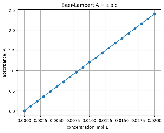
1. First plot - a Beer-Lambert style line#
Assume path length \(b=1\) cm and molar absorptivity \(\epsilon=120\ \mathrm{L\ mol^{-1}\ cm^{-1}}\). Plot absorbance vs concentration.
# Imports used throughout this lecture
import numpy as np
import pandas as pd
import matplotlib.pyplot as plt
epsilon = 120.0   # L mol^-1 cm^-1
b = 1.0           # cm
c = np.linspace(0, 0.02, 21)     # mol L^-1
A = epsilon * b * c

plt.plot(c, A, marker="o")
plt.xlabel("concentration, mol L$^{-1}$")
plt.ylabel("absorbance, A")
plt.title("Beer-Lambert A = ε b c")
plt.grid(True)
1.1 What each plotting call means#
plt.figure(figsize=(w, h))
Start a new blank figure. Use it when you do not want a new plot to draw on top of an old one.
figsizeis width and height in inches. Example:(6, 4).
plt.plot(x, y, marker="o", linestyle="-", linewidth=1, label="text")
Draw a line plot of y vs x.
marker="o"puts a circle at each data point.linestylecan be"-","--",":", or"-.".linewidthcontrols line thickness.labelsets the name shown in a legend.
plt.xlabel("text"), plt.ylabel("text")
Label the horizontal and vertical axes. You can include math with $...$, for example mol L$^{-1}$.
plt.title("text")
Add a title to the axes.
plt.grid(True)
Show a grid to make reading values easier.
You can target one axis with
plt.grid(axis="y").
plt.xlim(left, right), plt.ylim(bottom, top)
Set the visible range for each axis. Use these to zoom in or to force the origin to be visible.
Example:
plt.xlim(0, c.max()).
plt.legend()
Show a legend for any lines that have a label=.
plt.savefig("name.png", dpi=150, bbox_inches="tight")
Save the current figure to a file.
dpicontrols sharpness for raster formats.bbox_inches="tight"trims extra margins.
1.2 Mini examples#
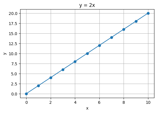
1) Basic line with markers
x = np.linspace(0, 10, 11)
y = 2 * x

plt.figure(figsize=(6, 4))
plt.plot(x, y, marker="o")         # line plus markers
plt.xlabel("x")
plt.ylabel("y")
plt.title("y = 2x")
plt.grid(True)
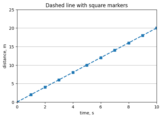
2) Change style and set limits
plt.figure(figsize=(6, 4))
plt.plot(x, y, linestyle="--", marker="s", linewidth=2)
plt.xlabel("time, s")
plt.ylabel("distance, m")
plt.title("Dashed line with square markers")
plt.grid(axis="y")
plt.xlim(0, 10)
plt.ylim(0, 25)
(0.0, 25.0)
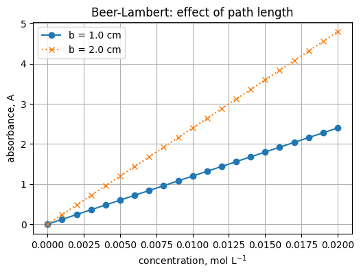
3) Two lines and a legend
c = np.linspace(0.0, 0.020, 21)   # mol L^-1
epsilon = 120.0                   # L mol^-1 cm^-1
b1 = 1.0                          # cm
b2 = 2.0                          # cm

A1 = epsilon * b1 * c
A2 = epsilon * b2 * c

plt.figure(figsize=(6, 4))
plt.plot(c, A1, marker="o", label="b = 1.0 cm")
plt.plot(c, A2, marker="x", linestyle=":", label="b = 2.0 cm")
plt.xlabel("concentration, mol L$^{-1}$")
plt.ylabel("absorbance, A")
plt.title("Beer-Lambert: effect of path length")
plt.grid(True)
plt.legend()
<matplotlib.legend.Legend at 0x201bb516a30>
4) Save the figure to a file
plt.savefig("beer_lambert_example.png", dpi=150, bbox_inches="tight")
"Saved file: beer_lambert_example.png"
'Saved file: beer_lambert_example.png'
<Figure size 640x480 with 0 Axes>
1.3 Quick troubleshooting#
New plot drew on top of the old one
→ Callplt.figure()before the newplt.plot(...).Empty figure in some environments
→ In classic Jupyter, add%matplotlib inlinenear the top of the notebook.Labels cut off when saving
→ Usebbox_inches="tight"inplt.savefig(...).
Exercise 9.1
Change \(\epsilon\) to 80 and re-run. What happens to the slope? :class: dropdown
Answer - the line is less steep because absorbance is proportional to \(\epsilon\).
Common message types
NameError - you misspelled a name or used it before defining it.
TypeError - you used the wrong kind of value.
KeyError - dictionary key not found, e.g.
"Na"missing fromaw.
Save your work
Click Save or press Ctrl+S. Commit to version control if you use git.
2. Quick gallery of plot types#
We will generate small arrays and plot them. Run each cell and read the comments.
Parameters to know for line plots
plt.plot(x, y, ...)
markershape of points, e.g."o","s","x","^"linestyleline pattern, e.g."-","--",":","-."linewidththickness in pointslabeltext used inplt.legend()alphatransparency from 0 to 1
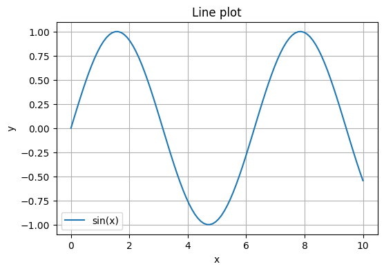
x = np.linspace(0, 10, 100)
y = np.sin(x)

plt.figure(figsize=(6, 4))
plt.plot(x, y, label="sin(x)")
plt.xlabel("x")
plt.ylabel("y")
plt.title("Line plot")
plt.grid(True)
plt.legend()
<matplotlib.legend.Legend at 0x201bc75c2b0>
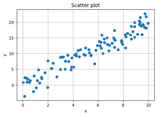
Parameters to know for scatter
plt.scatter(x, y, ...)
smarker size in points squaredmarkermarker shapealphatransparencyccolors for points; pass a single color or an array mapped to a colormapcmapcolormap used whencis numeric
rng = np.random.default_rng(0)
x = rng.uniform(0, 10, 100)
y = 2 * x + rng.normal(0, 2, size=100)

plt.figure(figsize=(6, 4))
plt.scatter(x, y)
plt.xlabel("x")
plt.ylabel("y")
plt.title("Scatter plot")
plt.grid(True)
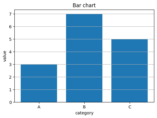
categories = ["A", "B", "C"]
heights = [3, 7, 5]

plt.figure(figsize=(6, 4))
plt.bar(categories, heights)
plt.xlabel("category")
plt.ylabel("value")
plt.title("Bar chart")
plt.grid(axis="y")
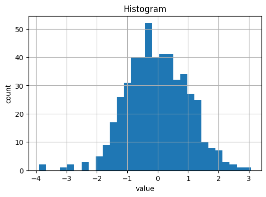
Parameters to know for histograms
plt.hist(data, ...)
binsnumber of bins or bin edgesrangelower and upper bound for binsdensity=Trueto show a probability density instead of countsalphatransparency when overlaying multiple histograms
data = rng.normal(0, 1, size=500)

plt.figure(figsize=(6, 4))
plt.hist(data, bins=30)
plt.xlabel("value")
plt.ylabel("count")
plt.title("Histogram")
plt.grid(True)
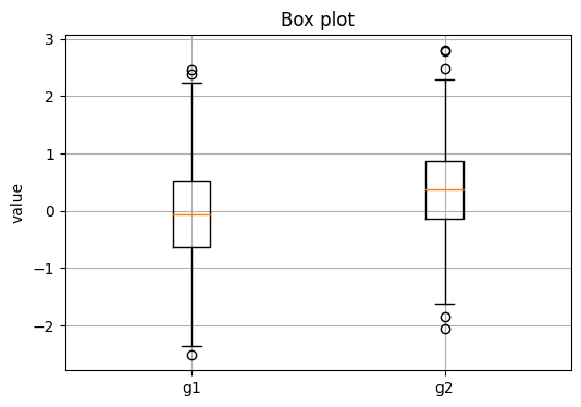
Parameters to know for box plots
plt.boxplot(data, ...)
labelsnames under each boxshowmeans=Trueto mark the meanwhiswhisker length as a factor of IQR or a percentile
group1 = rng.normal(0, 1, size=200)
group2 = rng.normal(0.5, 0.8, size=200)

plt.figure(figsize=(6, 4))
plt.boxplot([group1, group2], labels=["g1", "g2"])
plt.ylabel("value")
plt.title("Box plot")
plt.grid(True)
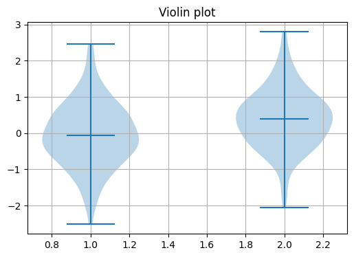
Parameters to know for violin plots
plt.violinplot(data, ...)
showmeans,showmedians,showextrematoggles for guideswidthsoverall width of violinsInput is a list of arrays or a 2D array by column
plt.figure(figsize=(6, 4))
plt.violinplot([group1, group2], showmeans=True)
plt.title("Violin plot")
plt.grid(True)
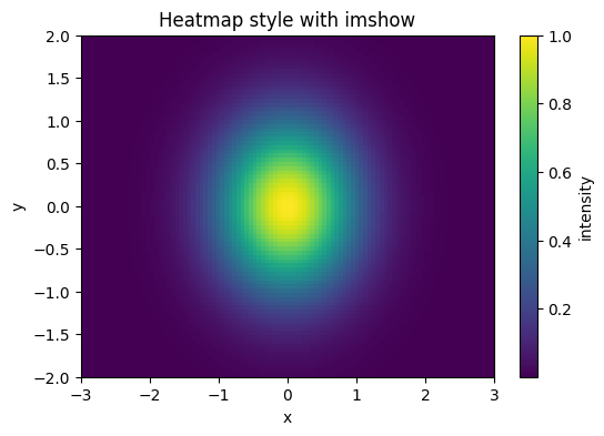
Parameters to know for heatmaps with imshow
plt.imshow(Z, ...)
origin="lower"puts row 0 at the bottomaspect="auto"lets axes scale independentlyextent=[xmin, xmax, ymin, ymax]maps array indices to axis coordinatesAdd
plt.colorbar(label="...")to show a scale
# Heatmap with imshow
x = np.linspace(-3, 3, 101)
y = np.linspace(-2, 2, 81)
X, Y = np.meshgrid(x, y)
Z = np.exp(-(X**2 + Y**2))

plt.figure(figsize=(6, 4))
plt.imshow(Z, aspect="auto", origin="lower", extent=[x.min(), x.max(), y.min(), y.max()])
plt.colorbar(label="intensity")
plt.xlabel("x")
plt.ylabel("y")
plt.title("Heatmap style with imshow")
Text(0.5, 1.0, 'Heatmap style with imshow')
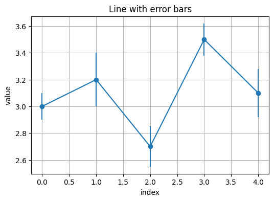
# Error bars
x = np.arange(5)
y = np.array([3.0, 3.2, 2.7, 3.5, 3.1])
yerr = np.array([0.1, 0.2, 0.15, 0.12, 0.18])

plt.figure(figsize=(6, 4))
plt.errorbar(x, y, yerr=yerr, fmt="o-")
plt.xlabel("index")
plt.ylabel("value")
plt.title("Line with error bars")
plt.grid(True)
3. Pandas essentials#
3.1 What is pandas and why pd?#
Read
pandas is a Python library for working with tabular data. It gives you two core objects:
Series: one labeled column of data.
DataFrame: a table made of many Series sharing the same row index.
By convention we write import pandas as pd. The short alias pd saves typing and you will see it in almost every example online and in documentation.
# Imports used throughout this lecture
import numpy as np
import pandas as pd
import matplotlib.pyplot as plt
3.2 What is a DataFrame and why do people name it df?#
Read
A DataFrame is a 2D table with labeled rows and columns. It keeps:
df.values- the actual numbers or strings as a NumPy array-likedf.index- row labelsdf.columns- column namesdf.dtypes- data type of each column
df is not a special keyword. It is just a common variable name for “this DataFrame”.
You can name it data, table, or anything else. We will use df because it is short and familiar.
# Build a small DataFrame
df = pd.DataFrame(
    {
        "compound": ["CO2", "H2O", "NH3", "CH4"],
        "molar_mass": [44.0095, 18.0153, 17.0305, 16.0430],
        "state": ["gas", "liquid", "gas", "gas"]
    }
)

# Inspect the table
print("Shape:", df.shape)        # (rows, columns)
print("\nDtypes:\n", df.dtypes)  # data types per column
print("\nHead:\n", df.head())    # first 5 rows
Shape: (4, 3)

Dtypes:
 compound       object
molar_mass    float64
state          object
dtype: object

Head:
   compound  molar_mass   state
0      CO2     44.0095     gas
1      H2O     18.0153  liquid
2      NH3     17.0305     gas
3      CH4     16.0430     gas
Key ideas
Select one column:
df["molar_mass"]gives a Series.Select several columns:
df[["compound", "state"]]gives a DataFrame.Filter rows:
df[df["state"] == "gas"]Location by labels vs positions:
.loc[rows, cols]uses labels, e.g.df.loc[1:3, ["compound", "molar_mass"]].iloc[r, c]uses integer positions, e.g.df.iloc[0:2, 0:2]
# A quick select, filter, and compute
gases = df[df["state"] == "gas"]
mass_ratio = df["molar_mass"] / df.loc[df["compound"] == "H2O", "molar_mass"].iloc[0]
df = df.assign(mass_ratio_to_water = mass_ratio)
df
| compound | molar_mass | state | mass_ratio_to_water | |
|---|---|---|---|---|
| 0 | CO2 | 44.0095 | gas | 2.442896 |
| 1 | H2O | 18.0153 | liquid | 1.000000 |
| 2 | NH3 | 17.0305 | gas | 0.945335 |
| 3 | CH4 | 16.0430 | gas | 0.890521 |
# Inspect
df.head(), df.shape, df.dtypes, df.index, df.columns
(  compound  molar_mass   state  mass_ratio_to_water
 0      CO2     44.0095     gas             2.442896
 1      H2O     18.0153  liquid             1.000000
 2      NH3     17.0305     gas             0.945335
 3      CH4     16.0430     gas             0.890521,
 (4, 4),
 compound                object
 molar_mass             float64
 state                   object
 mass_ratio_to_water    float64
 dtype: object,
 RangeIndex(start=0, stop=4, step=1),
 Index(['compound', 'molar_mass', 'state', 'mass_ratio_to_water'], dtype='object'))
Try
Use df.info() and df.describe() below.
df.info()
<class 'pandas.core.frame.DataFrame'>
RangeIndex: 4 entries, 0 to 3
Data columns (total 4 columns):
 #   Column               Non-Null Count  Dtype
---  ------               --------------  -----
 0   compound             4 non-null      object
 1   molar_mass           4 non-null      float64
 2   state                4 non-null      object
 3   mass_ratio_to_water  4 non-null      float64
dtypes: float64(2), object(2)
memory usage: 256.0+ bytes
df.describe()
| molar_mass | mass_ratio_to_water | |
|---|---|---|
| count | 4.000000 | 4.000000 |
| mean | 23.774575 | 1.319688 |
| std | 13.513959 | 0.750138 |
| min | 16.043000 | 0.890521 |
| 25% | 16.783625 | 0.931632 |
| 50% | 17.522900 | 0.972668 |
| 75% | 24.513850 | 1.360724 |
| max | 44.009500 | 2.442896 |
Practice
Add a new row for O2 with molar mass 31.998 and state “gas”. Hint: pd.concat with a tiny DataFrame.
3.2 Selecting rows and columns#
Read
Use [] for a single column, .loc for names, .iloc for positions, and boolean masks for filters.
df["molar_mass"] # column by name
0    44.0095
1    18.0153
2    17.0305
3    16.0430
Name: molar_mass, dtype: float64
df[["compound", "state"]] # multiple columns
| compound | state | |
|---|---|---|
| 0 | CO2 | gas |
| 1 | H2O | liquid |
| 2 | NH3 | gas |
| 3 | CH4 | gas |
gases = df[df["state"] == "gas"]
gases
| compound | molar_mass | state | mass_ratio_to_water | |
|---|---|---|---|---|
| 0 | CO2 | 44.0095 | gas | 2.442896 |
| 2 | NH3 | 17.0305 | gas | 0.945335 |
| 3 | CH4 | 16.0430 | gas | 0.890521 |
df_loc = df.loc[1:3, ["compound", "molar_mass"]]
df_loc
| compound | molar_mass | |
|---|---|---|
| 1 | H2O | 18.0153 |
| 2 | NH3 | 17.0305 |
| 3 | CH4 | 16.0430 |
df_iloc = df.iloc[0:2, 0:2]
df_iloc
| compound | molar_mass | |
|---|---|---|
| 0 | CO2 | 44.0095 |
| 1 | H2O | 18.0153 |
Try
Filter rows where molar_mass > 20, then select only compound and molar_mass.
Practice
Sort by molar_mass descending and show the top 3 rows.
3.3 New columns, sorting, missing values#
Read
You can compute new columns from old ones. Handle missing values with isna, fillna, or dropna.
df["mass_ratio_to_water"] = df["molar_mass"] / df.loc[df["compound"] == "H2O", "molar_mass"].iloc[0]
df.sort_values("molar_mass")
| compound | molar_mass | state | mass_ratio_to_water | |
|---|---|---|---|---|
| 3 | CH4 | 16.0430 | gas | 0.890521 |
| 2 | NH3 | 17.0305 | gas | 0.945335 |
| 1 | H2O | 18.0153 | liquid | 1.000000 |
| 0 | CO2 | 44.0095 | gas | 2.442896 |
df2 = df.copy()
df2.loc[2, "molar_mass"] = np.nan
df2.isna().sum(), df2.fillna({"molar_mass": df2["molar_mass"].mean()})
(compound               0
 molar_mass             1
 state                  0
 mass_ratio_to_water    0
 dtype: int64,
   compound  molar_mass   state  mass_ratio_to_water
 0      CO2     44.0095     gas             2.442896
 1      H2O     18.0153  liquid             1.000000
 2      NH3     26.0226     gas             0.945335
 3      CH4     16.0430     gas             0.890521)
Try
Create a boolean column is_gas from state.
4. Read a CSV#
Read
Use one of the three options. If you have trouble, use Option C to generate the file inside the notebook.
Option A. Upload in Colab
# Copy and paste below code. It runs at google Colab only
from google.colab import files
uploaded = files.upload()  # choose a CSV
import io
df_csv = pd.read_csv(io.BytesIO(uploaded["sample_beer_lambert.csv"]))  # change name if needed
df_csv.head()
Option B. Load from a URL
import pandas as pd

url = "https://raw.githubusercontent.com/zzhenglab/ai4chem/main/book/_data/sample_beer_lambert.csv"
df = pd.read_csv(url)
df.head()
| concentration_mol_L | replicate | absorbance_A | |
|---|---|---|---|
| 0 | 0.000 | 1 | 0.0050 |
| 1 | 0.000 | 2 | -0.0032 |
| 2 | 0.000 | 3 | 0.0017 |
| 3 | 0.002 | 1 | 0.2448 |
| 4 | 0.002 | 2 | 0.2401 |
Option C. Create a CSV inside the notebook
csv_text = """concentration_mol_L,replicate,absorbance_A
0,1,0.005
0,2,-0.0032
0,3,0.0017
0.002,1,0.2448
0.002,2,0.2401
0.002,3,0.2105
0.004,1,0.4949
0.004,2,0.4331
0.004,3,0.4839
0.006,1,0.7199
0.006,2,0.7337
0.006,3,0.7272
0.008,1,0.8507
0.008,2,0.8576
0.008,3,0.8811
0.01,1,1.2017
0.01,2,1.2917
0.01,3,1.1927
0.012,1,1.4496
0.012,2,1.4109
0.012,3,1.4486
0.014,1,1.6345
0.014,2,1.6754
0.014,3,1.6719
0.016,1,1.9118
0.016,2,1.9155
0.016,3,1.9102
0.018,1,2.3632
0.018,2,2.2603
0.018,3,2.1607
0.02,1,2.3984
0.02,2,2.3021
0.02,3,2.4011

"""

with open("sample_beer_lambert.csv", "w") as f:
    f.write(csv_text)

df_csv = pd.read_csv("sample_beer_lambert.csv")
df_csv.head()
| concentration_mol_L | replicate | absorbance_A | |
|---|---|---|---|
| 0 | 0.000 | 1 | 0.0050 |
| 1 | 0.000 | 2 | -0.0032 |
| 2 | 0.000 | 3 | 0.0017 |
| 3 | 0.002 | 1 | 0.2448 |
| 4 | 0.002 | 2 | 0.2401 |
Practice
If your file uses semicolons, call pd.read_csv("file.csv", sep=";"). If it uses comma decimals, add decimal=",".
5. From CSV to plots#
5.1 Inspect and clean#
Read
Always inspect, then remove impossible values.
df = df_csv.copy()
df.head(), df.shape, df.isna().sum()
(   concentration_mol_L  replicate  absorbance_A
 0                0.000          1        0.0050
 1                0.000          2       -0.0032
 2                0.000          3        0.0017
 3                0.002          1        0.2448
 4                0.002          2        0.2401,
 (33, 3),
 concentration_mol_L    0
 replicate              0
 absorbance_A           0
 dtype: int64)
df = df[df["absorbance_A"].between(-0.05, 3.0)].reset_index(drop=True)
df.head()
| concentration_mol_L | replicate | absorbance_A | |
|---|---|---|---|
| 0 | 0.000 | 1 | 0.0050 |
| 1 | 0.000 | 2 | -0.0032 |
| 2 | 0.000 | 3 | 0.0017 |
| 3 | 0.002 | 1 | 0.2448 |
| 4 | 0.002 | 2 | 0.2401 |
Try
Count rows per concentration with value_counts() on concentration_mol_L.
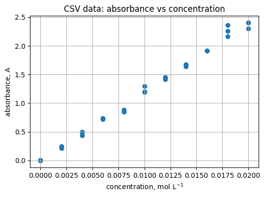
5.2 Scatter of absorbance vs concentration#
Read
Scatter shows the spread around the line.
plt.figure(figsize=(6, 4))
plt.scatter(df["concentration_mol_L"], df["absorbance_A"])
plt.xlabel("concentration, mol L$^{-1}$")
plt.ylabel("absorbance, A")
plt.title("CSV data: absorbance vs concentration")
plt.grid(True)
Practice
Add light jitter to concentration to reduce overlap. Hint: add np.random.normal(0, 2e-5, size=...) to x values.
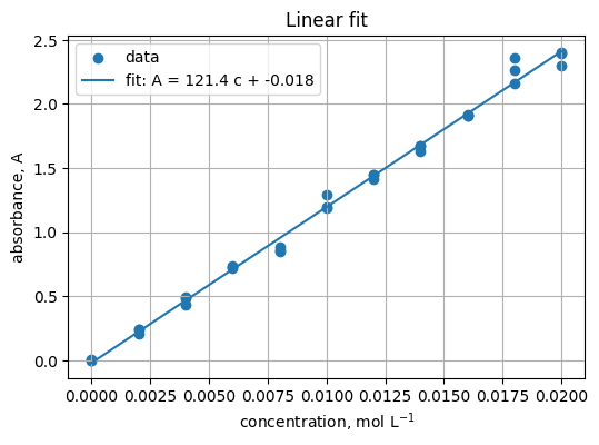
5.3 Fit a straight line#
Read
Fit A = m c + b. Expect m near ε b.
x = df["concentration_mol_L"].to_numpy()
y = df["absorbance_A"].to_numpy()
m, b0 = np.polyfit(x, y, 1)
m, b0
(121.43060606060605, -0.017903030303029907)
xline = np.linspace(x.min(), x.max(), 100)
yline = m * xline + b0

plt.figure(figsize=(6, 4))
plt.scatter(x, y, label="data")
plt.plot(xline, yline, label=f"fit: A = {m:.1f} c + {b0:.3f}")
plt.xlabel("concentration, mol L$^{-1}$")
plt.ylabel("absorbance, A")
plt.title("Linear fit")
plt.grid(True)
plt.legend()
<matplotlib.legend.Legend at 0x201bdc76eb0>
Practice
Compute residuals y - (m*x + b0) and plot a histogram with 20 bins.
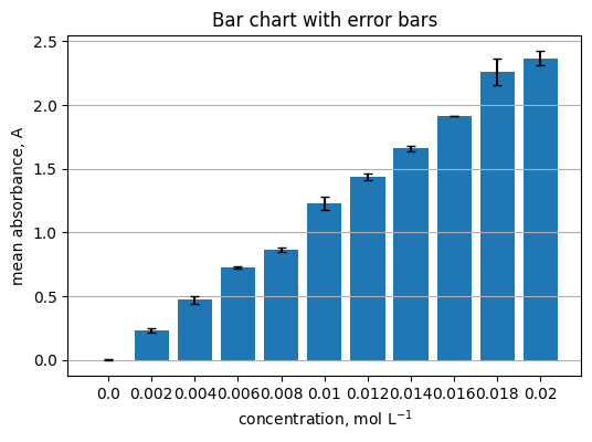
5.4 Group by concentration and show a bar chart with error bars#
Read
Summarize replicates per concentration.
summary = (
    df.groupby("concentration_mol_L")["absorbance_A"]
      .agg(["mean", "std", "count"])
      .reset_index()
)
summary.head()
| concentration_mol_L | mean | std | count | |
|---|---|---|---|---|
| 0 | 0.000 | 0.001167 | 0.004126 | 3 |
| 1 | 0.002 | 0.231800 | 0.018595 | 3 |
| 2 | 0.004 | 0.470633 | 0.032967 | 3 |
| 3 | 0.006 | 0.726933 | 0.006904 | 3 |
| 4 | 0.008 | 0.863133 | 0.015937 | 3 |
centers = summary["concentration_mol_L"].to_numpy()
means = summary["mean"].to_numpy()
errs = summary["std"].to_numpy()

plt.figure(figsize=(6, 4))
plt.bar(centers.astype(str), means, yerr=errs, capsize=3)
plt.xlabel("concentration, mol L$^{-1}$")
plt.ylabel("mean absorbance, A")
plt.title("Bar chart with error bars")
plt.grid(axis="y")
Practice
Replace bars with a scatter plot of means and vertical error bars using plt.errorbar.
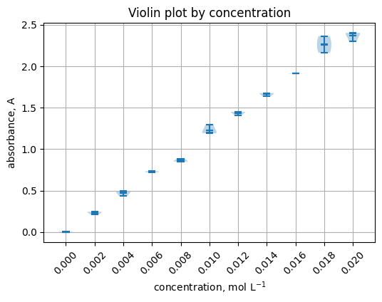
5.5 Violin plot by concentration#
groups = [grp["absorbance_A"].to_numpy() for _, grp in df.groupby("concentration_mol_L")]
labels = [f"{c:.3f}" for c in sorted(df["concentration_mol_L"].unique())]

plt.figure(figsize=(6, 4))
plt.violinplot(groups, showmeans=True, showextrema=True, showmedians=True)
plt.xticks(range(1, len(labels) + 1), labels, rotation=45)
plt.xlabel("concentration, mol L$^{-1}$")
plt.ylabel("absorbance, A")
plt.title("Violin plot by concentration")
plt.grid(True)
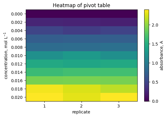
5.6 Heatmap of a pivot table#
pivot = df.pivot_table(index="concentration_mol_L", columns="replicate", values="absorbance_A", aggfunc="mean")
pivot
| replicate | 1 | 2 | 3 |
|---|---|---|---|
| concentration_mol_L | |||
| 0.000 | 0.0050 | -0.0032 | 0.0017 |
| 0.002 | 0.2448 | 0.2401 | 0.2105 |
| 0.004 | 0.4949 | 0.4331 | 0.4839 |
| 0.006 | 0.7199 | 0.7337 | 0.7272 |
| 0.008 | 0.8507 | 0.8576 | 0.8811 |
| 0.010 | 1.2017 | 1.2917 | 1.1927 |
| 0.012 | 1.4496 | 1.4109 | 1.4486 |
| 0.014 | 1.6345 | 1.6754 | 1.6719 |
| 0.016 | 1.9118 | 1.9155 | 1.9102 |
| 0.018 | 2.3632 | 2.2603 | 2.1607 |
| 0.020 | 2.3984 | 2.3021 | 2.4011 |
plt.figure(figsize=(6, 4))
plt.imshow(pivot.to_numpy(), aspect="auto")
plt.colorbar(label="absorbance, A")
plt.yticks(range(pivot.shape[0]), [f"{c:.3f}" for c in pivot.index])
plt.xticks(range(pivot.shape[1]), [str(c) for c in pivot.columns])
plt.xlabel("replicate")
plt.ylabel("concentration, mol L$^{-1}$")
plt.title("Heatmap of pivot table")
plt.grid(False)
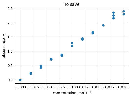
5.7 Save a figure#
plt.figure(figsize=(6, 4))
plt.scatter(x, y)
plt.xlabel("concentration, mol L$^{-1}$")
plt.ylabel("absorbance, A")
plt.title("To save")
plt.grid(True)
plt.savefig("scatter_absorbance_vs_conc.png", dpi=150, bbox_inches="tight")
"Saved: scatter_absorbance_vs_conc.png"
'Saved: scatter_absorbance_vs_conc.png'
6. Quick reference#
Pandas
import pandas as pd→ library aliasdf = pd.read_csv("file.csv"),df.to_csv("out.csv", index=False)Inspect:
df.head(),df.info(),df.describe(),df.shape,df.dtypesSelect:
df["col"],df.loc[rows, cols],df.iloc[r, c]Filter:
df[df["col"] > 0]Group:
df.groupby("key")["val"].agg(["mean", "std"])
Plots
Start a new figure:
plt.figure(...)Line, scatter, bar:
plt.plot(x, y),plt.scatter(x, y),plt.bar(labels, values)Distribution and 2D:
plt.hist(x),plt.violinplot(list_of_arrays),plt.imshow(matrix)Labels and title:
plt.xlabel,plt.ylabel,plt.titleGrid and legend:
plt.grid(True),plt.legend()Save:
plt.savefig("name.png", dpi=150, bbox_inches="tight")Useful kwargs to remember:
marker,linestyle,linewidth,alpha,bins,yerr,capsize,extent,aspect
7. Glossary#
- Series#
One labeled column in pandas. Think of a vector with an index. Example:
df["yield_percent"].- DataFrame#
A 2D table of columns, each a Series. Example:
pd.read_csv("file.csv").- index#
The row labels of a Series or DataFrame. Access with
.index.- dtype#
The data type for a column. See with
df.dtypes.- boolean mask#
True or False array used to filter rows. Example:
df[df["yield_percent"] > 50].- groupby#
Split rows by a key, then compute summaries. Example:
df.groupby("state")["molar_mass"].mean().- pivot table#
Reshape long data into a 2D grid of values. Example:
df.pivot_table(index="temp", columns="time", values="yield").- NaN#
A missing value. Handle with
isna,fillna, ordropna.- CSV#
Comma-separated values text file. Read with
pd.read_csv, write withdf.to_csv.- figure#
The canvas for a plot. Create with
plt.figure(figsize=(w, h)).- axes#
The plotting area inside a figure. Most
plt.*calls draw to the current axes.- label#
The text used in legends. Set with
label=in plotting functions.- alpha#
Transparency from 0 to 1 in plots.
- bins#
Controls histogram resolution. More bins show more detail, fewer bins smooth the shape.
- yerr#
Error bar sizes along y for
plt.errorbarorplt.bar.- colormap#
Maps numeric values to colors in heatmaps. Set with
cmap=....- aspect#
Ratio of the axes. Use
"auto"for data-driven scaling inplt.imshow.- extent#
Maps array indices to axis coordinates in
plt.imshow.- figsize#
Plot size in inches as
(width, height)passed toplt.figure.
8. In-class activity#
Each task mirrors what you practiced. Fill in ... and later compare with the solutions in Section 9. Keep your edits near the # TO DO: lines.
8.1 Read and inspect a CSV#
Read a CSV, preview structure, and count rows where a chosen column is greater than a threshold.
import pandas as pd

# Path to a CSV
path = ... # "sample_beer_lambert.csv" we see in section 4

df = ...  # TO DO: read the CSV with pd.read_csv(path)
print(df.head())
print(df.info())
print(df.describe())

# Count how many rows satisfy a condition (pick a numeric column)
mask = ...  # TO DO: boolean mask, e.g., df["absorbance_A"] > 0
count_positive = ...  # TO DO: mask.sum()
print("rows with condition:", count_positive)
Hint
Use pd.read_csv(path) then df.head(), df.info(), df.describe(). A boolean mask is an expression like df["col"] > value.
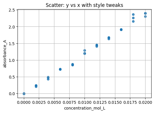
8.2 Scatter with style controls#
Make a scatter of one column vs another, then adjust style parameters.
import matplotlib.pyplot as plt

# Choose columns to plot
xcol = ...         # TO DO: e.g.,concentration
ycol = ...         # TO DO: e.g.,absorbance

# Style controls — change and re-run
point_size =  ...  # TO DO: e.g., 30
alpha_val  =  ...  # TO DO: e.g., 0.8
marker_sym =  ...  # TO DO: e.g., "o"

plt.figure(figsize=(6, 4))
plt.scatter(..., ..., s=..., alpha=..., marker=...)  # TO DO: e.g.,point_size, alpha_val, marker_sym

plt.xlabel(xcol)
plt.ylabel(ycol)
plt.title("Scatter: y vs x with style tweaks")
plt.grid(True)
Hint
See Section 2 for plt.scatter plus s, alpha, and marker.
8.3 Group, summarize, and draw error bars#
Group by a key and plot group means with standard deviation as error bars.
key_col = ...    # TO DO
val_col = ...    # TO DO

summary = (
    df.groupby(key_col)[val_col]
      .agg(["mean", "std", "count"])
      .reset_index()
)

x = summary[key_col].to_numpy()
y = summary["mean"].to_numpy()
yerr = ...  # TO DO: standard deviation array

plt.figure(figsize=(6, 4))
plt.errorbar(x, y, yerr=yerr, fmt="o-")
plt.xlabel(key_col)
plt.ylabel(f"mean {val_col}")
plt.title("Group means with error bars")
plt.grid(True)
Hint
Look back at 5.4 and the error bar example in Section 2.
8.4 New dataset — organic synthesis yields#
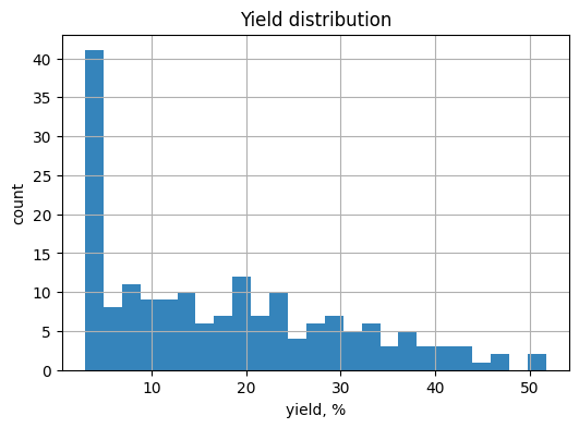
Work with organic_synthesis_yields.csv which has columns reaction_id, temperature_C, time_min, yield_percent. The yields are skewed toward lower values but still include some high yields. Tasks:
Read the CSV
Scatter
temperature_Cvsyield_percentColor points by
time_minusingc=...andcmap=...Build a pivot on
temperature_Cbytime_minforyield_percentand draw a heatmapDraw a histogram of
yield_percentwith differentbins
import numpy as np
import pandas as pd
import matplotlib.pyplot as plt

# Option A — read the provided CSV
path = "https://raw.githubusercontent.com/zzhenglab/ai4chem/main/book/_data/organic_synthesis_yields.csv"


df_y = ...  # TO DO: pd.read_csv(path)
df_y.head()
# 2) Scatter temperature vs yield
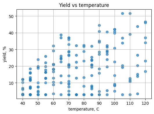
plt.figure(figsize=(6, 4))
plt.scatter(..., ..., alpha=0.7) # TO DO: SEE NEXT TWO LINES
plt.xlabel("temperature, C")
plt.ylabel("yield, %")
plt.title("Yield vs temperature")
plt.grid(True)
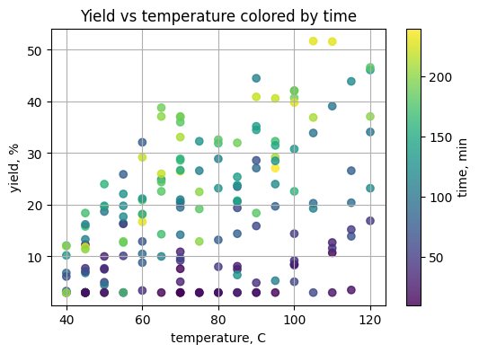
# 3) Color by time
plt.figure(figsize=(6, 4))
plt.scatter(df_y["temperature_C"], df_y["yield_percent"],
            c=..., cmap=..., alpha=0.8)  # TO DO: C = see next line
plt.colorbar(label="time, min")
plt.xlabel("temperature, C")
plt.ylabel("yield, %")
plt.title("Yield vs temperature colored by time")
plt.grid(True)
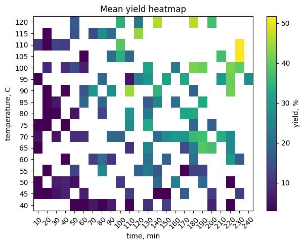
# 4) Pivot to a 2D grid and heatmap
pivot = df_y.pivot_table(index="temperature_C", columns="time_min",
                         values="yield_percent", aggfunc="mean")
plt.figure(figsize=(7, 5))
plt.imshow(pivot.to_numpy(), aspect="auto", origin="lower")
plt.colorbar(label="yield, %")
plt.yticks(range(pivot.shape[0]), pivot.index)
plt.xticks(range(pivot.shape[1]), pivot.columns, rotation=45)
plt.xlabel("time, min")
plt.ylabel("temperature, C")
plt.title("Mean yield heatmap")
plt.grid(False)
# 5) Histogram of yields
plt.figure(figsize=(6, 4))
plt.... # TO DO: try 15, 25, 40 for yield in histgram
plt.xlabel("yield, %")
plt.ylabel("count")
plt.title("Yield distribution")
plt.grid(True)
Make it downloadable
If you generate the CSV in the notebook, finish with:
df_y.to_csv("organic_synthesis_yields.csv", index=False)
8.5 Box and violin by binned temperature#
Bin temperature_C into categories and compare yield distributions across bins.
# Define bins and labels for temperature
bins = ...    # TO DO: e.g., 40, 60, 80, 100, 120
labels = ...  # TO DO: e.g., "40-60", "60-80", "80-100", "100-120"

df_y = ... # TO DO: make a copy
df_y["temp_bin"] = pd.cut(..., bins=bins, labels=labels, include_lowest=True)  # TO DO: column is df_y["temperature_C"]

# Build groups for violin or box plot
groups = [grp["yield_percent"].to_numpy() for _, grp in ...]  # TO DO

plt.figure(figsize=(6, 4))
# Choose one:
# plt.boxplot(groups, labels=labels, showmeans=True)
plt.violinplot(groups, showmeans=True)
plt.xticks(...) # TO DO: use range from 1 to len(labels) + 1 for labels
plt.ylabel("yield, %")
plt.title(...)
plt.grid(...)
Hint
Use pd.cut to form bins. For violins, pass a list of arrays in the same order as your labels.
9. Solutions#
Search for # TO DO: in each block above and compare to the full code here.
Solution 8.1#
import pandas as pd

path = "sample_beer_lambert.csv"
# TO DO: read the CSV
df = pd.read_csv(path)

print(df.head())
print(df.info())
print(df.describe())

# TO DO: boolean mask and count
mask = df["absorbance_A"] > 0
count_positive = mask.sum()
print("rows with condition:", count_positive)
   concentration_mol_L  replicate  absorbance_A
0                0.000          1        0.0050
1                0.000          2       -0.0032
2                0.000          3        0.0017
3                0.002          1        0.2448
4                0.002          2        0.2401
<class 'pandas.core.frame.DataFrame'>
RangeIndex: 33 entries, 0 to 32
Data columns (total 3 columns):
 #   Column               Non-Null Count  Dtype
---  ------               --------------  -----
 0   concentration_mol_L  33 non-null     float64
 1   replicate            33 non-null     int64
 2   absorbance_A         33 non-null     float64
dtypes: float64(2), int64(1)
memory usage: 920.0 bytes
None
       concentration_mol_L  replicate  absorbance_A
count            33.000000  33.000000     33.000000
mean              0.010000   2.000000      1.196403
std               0.006423   0.829156      0.781941
min               0.000000   1.000000     -0.003200
25%               0.004000   1.000000      0.494900
50%               0.010000   2.000000      1.201700
75%               0.016000   3.000000      1.910200
max               0.020000   3.000000      2.401100
rows with condition: 32
Solution 8.2#
import matplotlib.pyplot as plt

xcol = "concentration_mol_L"
ycol = "absorbance_A"

# TO DO: style controls
point_size = 30
alpha_val  = 0.8
marker_sym = "o"

plt.figure(figsize=(6, 4))
plt.scatter(df[xcol], df[ycol], s=point_size, alpha=alpha_val, marker=marker_sym)
plt.xlabel(xcol)
plt.ylabel(ycol)
plt.title("Scatter: y vs x with style tweaks")
plt.grid(True)
Solution 8.3#
key_col = "concentration_mol_L"
val_col = "absorbance_A"

summary = (
    df.groupby(key_col)[val_col]
      .agg(["mean", "std", "count"])
      .reset_index()
)

x = summary[key_col].to_numpy()
y = summary["mean"].to_numpy()
# TO DO: standard deviation array
yerr = summary["std"].to_numpy()

plt.figure(figsize=(6, 4))
plt.errorbar(x, y, yerr=yerr, fmt="o-")
plt.xlabel(key_col)
plt.ylabel(f"mean {val_col}")
plt.title("Group means with error bars")
plt.grid(True)
Solution 8.4#
import numpy as np
import pandas as pd
import matplotlib.pyplot as plt

# Use provided file if present
path = "https://raw.githubusercontent.com/zzhenglab/ai4chem/main/book/_data/organic_synthesis_yields.csv"

# TO DO: read CSV
df_y = pd.read_csv(path)
df_y.head()
| reaction_id | temperature_C | time_min | yield_percent | |
|---|---|---|---|---|
| 0 | 63 | 80 | 50 | 3.0 |
| 1 | 177 | 70 | 170 | 28.6 |
| 2 | 34 | 65 | 180 | 22.6 |
| 3 | 167 | 105 | 230 | 51.7 |
| 4 | 94 | 65 | 130 | 24.9 |
# TO DO: scatter temperature vs yield
plt.figure(figsize=(6, 4))
plt.scatter(df_y["temperature_C"], df_y["yield_percent"], alpha=0.7)
plt.xlabel("temperature, C")
plt.ylabel("yield, %")
plt.title("Yield vs temperature")
plt.grid(True)
# TO DO: color by time, choose a colormap
plt.figure(figsize=(6, 4))
plt.scatter(df_y["temperature_C"], df_y["yield_percent"],
            c=df_y["time_min"], cmap="viridis", alpha=0.8)
plt.colorbar(label="time, min")
plt.xlabel("temperature, C")
plt.ylabel("yield, %")
plt.title("Yield vs temperature colored by time")
plt.grid(True)
# TO DO: pivot and heatmap
pivot = df_y.pivot_table(index="temperature_C", columns="time_min",
                         values="yield_percent", aggfunc="mean")
plt.figure(figsize=(7, 5))
plt.imshow(pivot.to_numpy(), aspect="auto", origin="lower")
plt.colorbar(label="yield, %")
plt.yticks(range(pivot.shape[0]), pivot.index)
plt.xticks(range(pivot.shape[1]), pivot.columns, rotation=45)
plt.xlabel("time, min")
plt.ylabel("temperature, C")
plt.title("Mean yield heatmap")
plt.grid(False)
# TO DO: histogram with chosen bins
plt.figure(figsize=(6, 4))
plt.hist(df_y["yield_percent"], bins=25, alpha=0.9)
plt.xlabel("yield, %")
plt.ylabel("count")
plt.title("Yield distribution")
plt.grid(True)
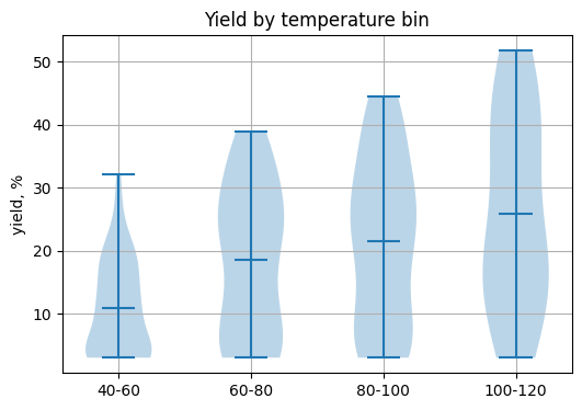
Solution 8.5#
import pandas as pd
import numpy as np
import matplotlib.pyplot as plt

# TO DO: define bins and labels
bins = [40, 60, 80, 100, 120]
labels = ["40-60", "60-80", "80-100", "100-120"]

df_y = df_y.copy()
df_y["temp_bin"] = pd.cut(df_y["temperature_C"], bins=bins, labels=labels, include_lowest=True)

# TO DO: build groups and draw plot
groups = [grp["yield_percent"].to_numpy() for _, grp in df_y.groupby("temp_bin")]

plt.figure(figsize=(6, 4))
plt.violinplot(groups, showmeans=True)
plt.xticks(range(1, len(labels) + 1), labels)
plt.ylabel("yield, %")
plt.title("Yield by temperature bin")
plt.grid(True)
In case you are curious how "organic_synthesis_yields.csv" is prepared (it’s synthesized dataset of synthesis!), here is the code:
rng = np.random.default_rng(42)
n = 180
temperature_C = rng.choice(np.arange(40, 121, 5), size=n, replace=True, p=np.linspace(2, 1, 17) / np.linspace(2, 1, 17).sum())
time_min = rng.choice(np.arange(10, 241, 10), size=n, replace=True, p=np.linspace(2, 1, 24) / np.linspace(2, 1, 24).sum())
temp_scale = (temperature_C - 30) / 60.0
time_scale = time_min / 180.0
base = 100 * (1 - np.exp(-temp_scale)) * (1 - np.exp(-time_scale))
noise_normal = rng.normal(0, 7, size=n)
noise_neg = -rng.gamma(shape=1.2, scale=4, size=n)
yield_percent = np.clip(np.round(base + noise_normal + noise_neg, 1), 3, 96)
df_new = pd.DataFrame({"reaction_id": np.arange(1, n + 1),
                       "temperature_C": temperature_C,
                       "time_min": time_min,
                       "yield_percent": yield_percent}).sample(frac=1, random_state=123).reset_index(drop=True)
df_new.to_csv("organic_synthesis_yields.csv", index=False)